← Zurück

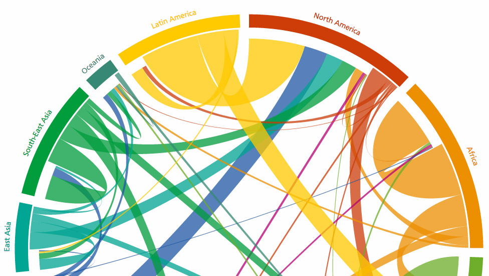
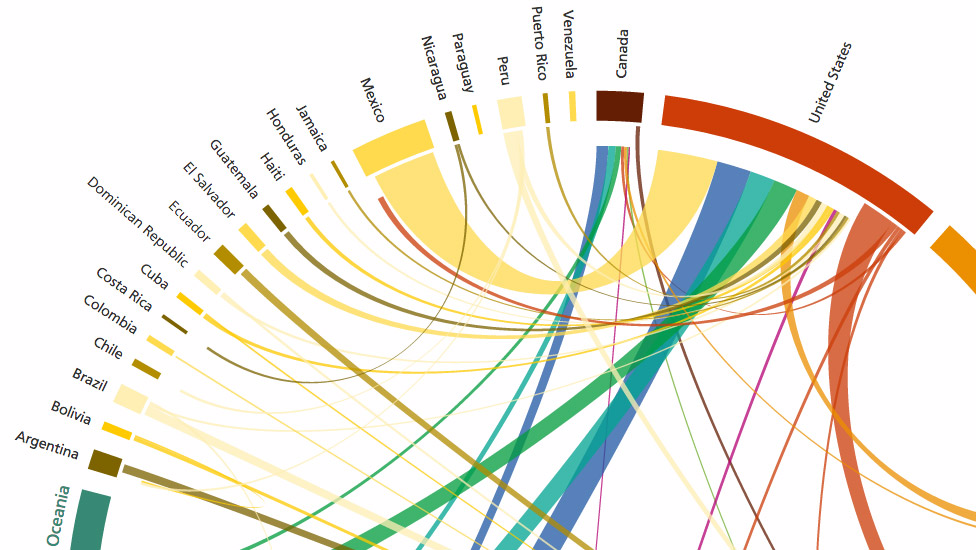
Global Migration
20 Jahre globaler Migrationsströme, in einem einzigen interaktiven Diagramm erfahrbar gemacht.
Design: Wittgenstein Centre for Demography and Global Human Capital
Herausragendes Informationsdesign, innovativ realisiert. Skalierbar, kompatibel, performant mit SVG, Javascript und D3.js
Publiziert in der FAZ, The Telegraph, Scientific American, Quartz, BoingBoing, Slate und Wired.
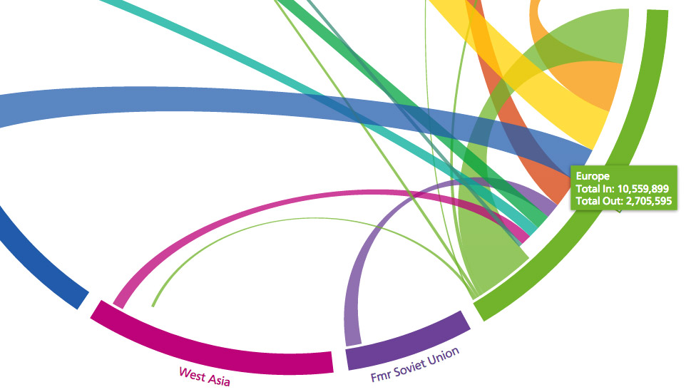
"Where everyone in the world is migrating—in one gorgeous chart" QZ.com